I was writing my masters thesis about the connection between a generalization of the reidemeister-torsion (called \(\ell^2\)-alexander torsion) and the thurston norm of 3-manifolds. Check it out, if you like:
I have used hyperlinks extensively. Especially the main part (section 4) is very short, as it links to previous results and definitions. Here is an example of how to read the thesis: (In dark mode the hyperlinks are highlighted in a light blue color, so they are easier to spot. In light mode they also work, but they are not highlighted, as my supervisor wanted)
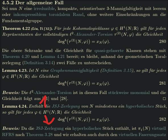
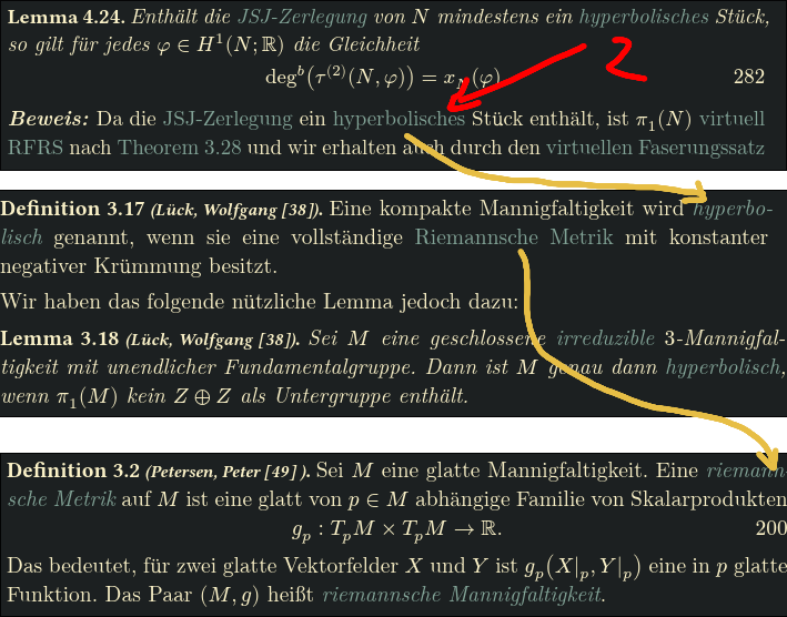
Let us look at lemma 4.24 which proofs the main theorem for manifolds whose JSJ-decomposition contains a hyperbolic part. In the proof, we can just click to where the JSJ-decomposition is defined.
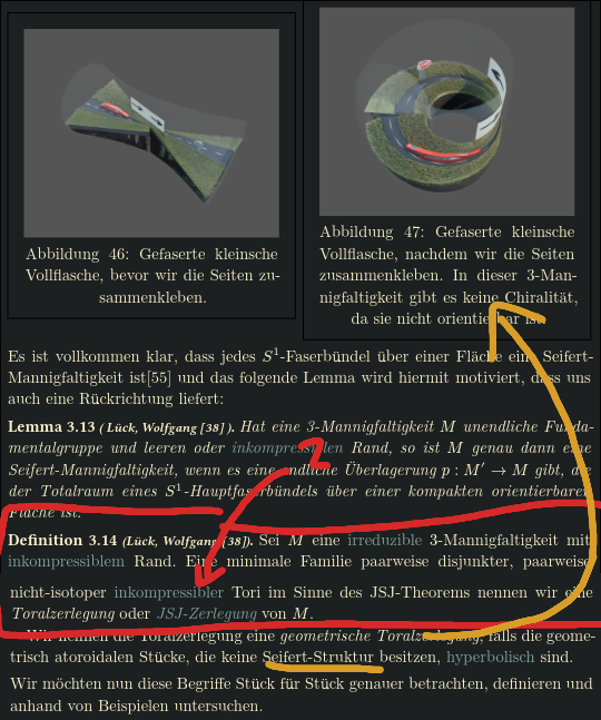
After clicking on “JSJ-Zerlegung”, the definition is shown. We are also shown directly what hyperbolic parts are. We also have directly above a few examples (3d-renders) of how such an incompressible torus of the JSJ-decomposition might look like (here a seifert part).
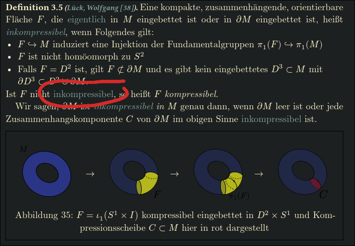
When clicking on “incompressible”, we also have directly the definition together with a visualization of it.
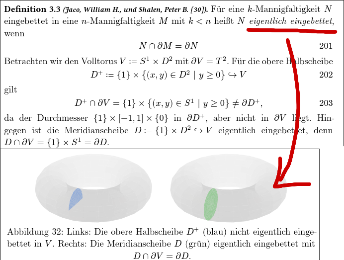
The definition of “incompressible” however used “proper embedding” internally, which is also reachable by hyperlink and visualized.
Next up in the proof, “hyperbolic” is used. We can follow this definition twice, until it is completely unfolded.
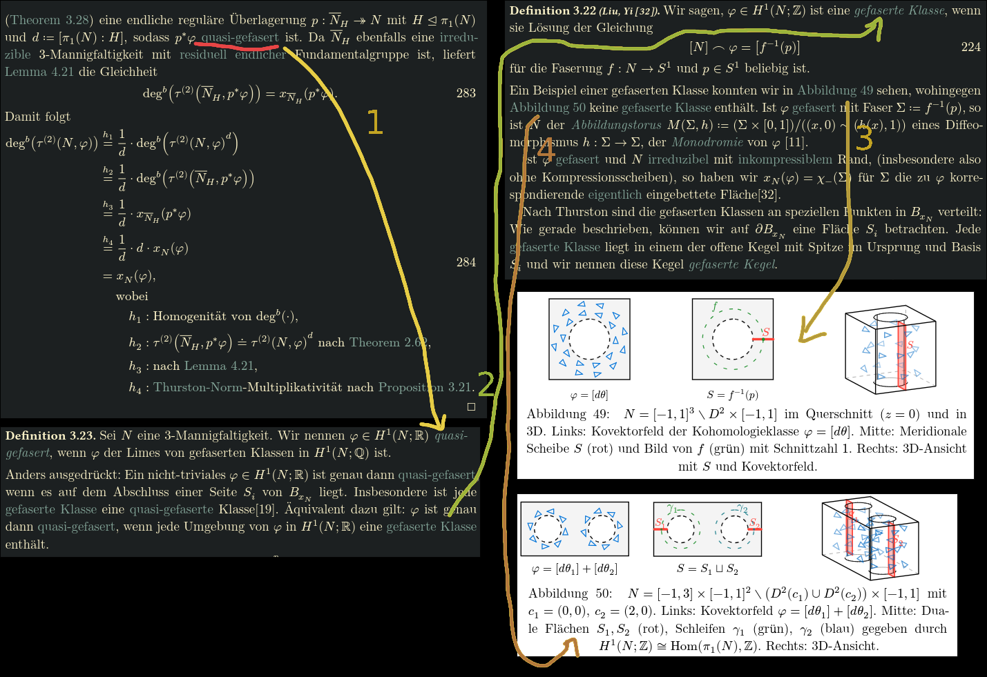
Skipping towards the end of the proof, we can find “quasi fibered classes” being used. We can follow this (1) to its definition, where these are defined as limits of “fibered classes”, which we can again look up (2). I have defined them in a non-standard way (equivalent to the standard definition, but I found my way more intuitive) and I provided examples for them (3) and counterexamples as well (4).
This also explains why the main part is so short.
Critique
My thesis was criticized, and the main points of critique boil down to the following points:
The visualizations are not rigorous enough (possibly childish)
Some examples (like the “physical interpretation”) of reidemeister torsion and its applications to physics were redundant
The notation is non-standard
The main part (section 4) is disproportionally short (only 25%) compared to the introductory sections (75%)
I had a mistake in definition 2.22 where I stated the absolute reidemeister torsion is independent of the choice of representation
It seemed rushed
Here are my thoughts on these points:
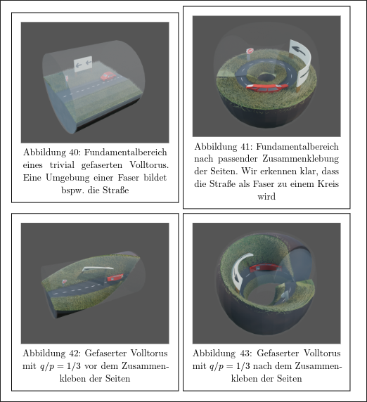
The main ctiricism was that I used 3d renders of a car in a tube which I have twisted using blenders geometry nodes to visualize “what life is like” in a seifert manifold:
3d renders of a car in a tube
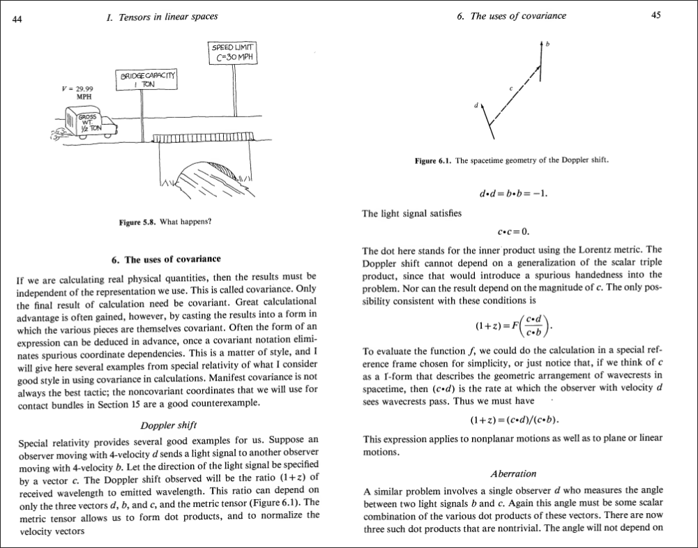
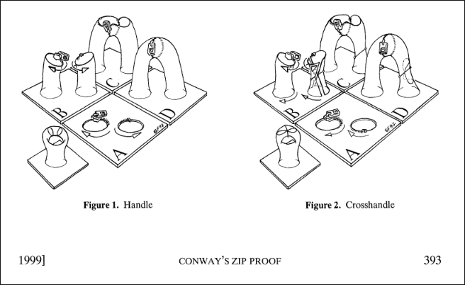
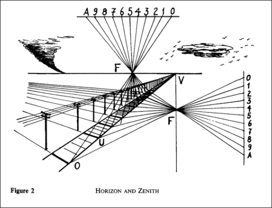
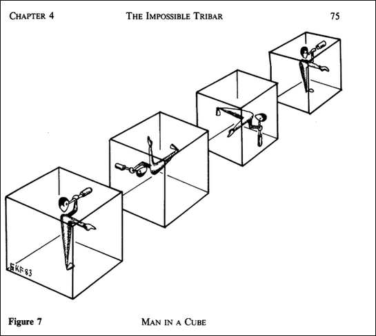
However, I was inspired by classical textbooks like “William L. Burke, Applied Differential Geometry (Cambridge University Press, 1985).”, which had this visualization (also including a car): and also Conway’s classical ZIP proof of the classification of surfaces, which uses pants and zippers to visualize the core ideas from geometry and topology:
William L. Burke, Applied Differential Geometry (Cambridge University Press, 1985), pp 44
Conways zip proof
George K. Francis, A Topological Picturebook, 2007
George K. Francis, A Topological Picturebook, 2007
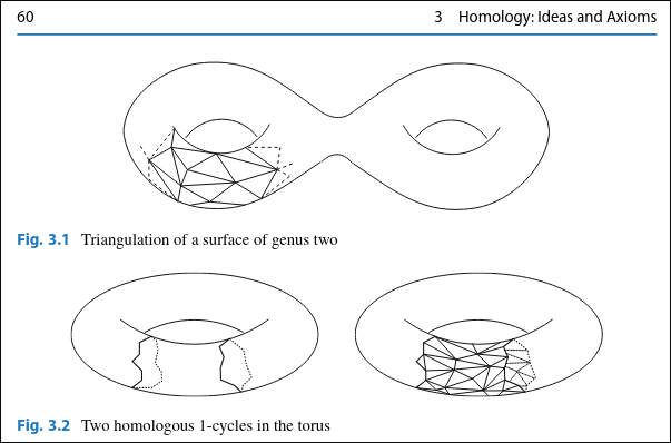
I was told my visualizations should have been more technical, like this visualization of a triangulation of a surface from “Holger Kammeyer, Introduction to Algebraic Topology (Springer International Publishing, 2022)”
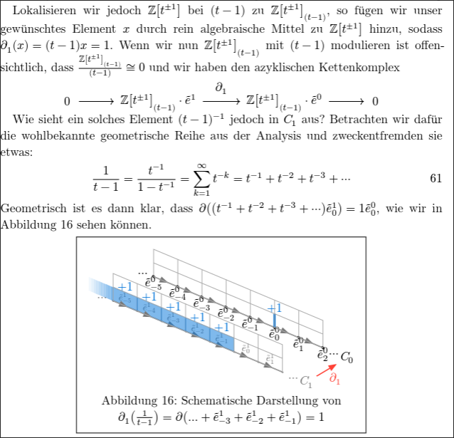
Regarding the physical interpretation, and general references to physics/cosmology, I think that there should be no shame in that. Physics and mathematics go hand in hand and I think it is cool to actually find applications of pure mathematics in “real like” (aka. physics). Also, I was quite proud of my “physical interpretation” of reidemeister torsion, as it related the predecessor of \(\ell^2\)-alexander torsion (reidemeister torsion) to electromagnetism. In fact, to see this connection one has to walk a fun journey through algebra, geometry, topology and analysis. I also just really liked how the geometric series suddenly showed up and related to monopoles and answered the question of “what does the reidemeister torsion actually measure?”
A short except from the passage about physical interpretations
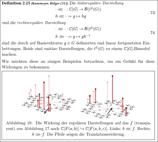
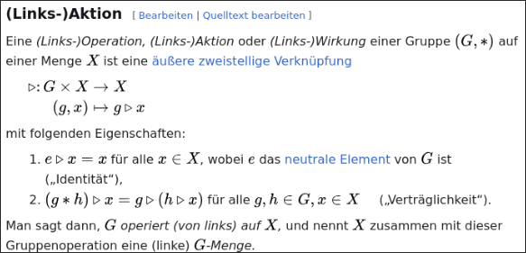
Fair enough, I used \(\lll\) and \(\ggg\) instead of \(\lambda\) and \(\rho\) for the left and right regular representation. I still think regarding currying that this was the right choice. It also more closely aligns with how group actions are usually denoted as \(a \triangleright x\) for \(a \in G\) and \(x \in X\) with \(G \curvearrowright X\).
The main section being short has already been explain in “How To Read This Thesis” above.
I have indeed stated an incorrect theorem. I have fixed that mistake since. The reidemeister torsion is only independent of the choice of representation up to equivalent representations. This was clear in my submitted thesis, but I nontheless made it more explicit now. This error feels more like when students forget to say “up to isomorphism” in their proofs.
Yes, I did have various grammatical and spelling errors. Also, the bibliography (exported using Zotero) had mistakes in it, which I did not catch. Should have been more careful and proofread it more often.
From this I have learned that I should have asked my supervisor more often for feedback, as errors could have been caught earlier. Regarding the visualizations and examples from physics, I still like them. Also the modern hyperlink based approach I would not like to change; but it seems the mathematical community is not ready for it yet.
import osfrom datetime import date, datetimeimport gitREPO_URL ="https://github.com/quoteme/masterarbeit.git"REPO_DIR ="/tmp/quoteme-masterarbeit"CUTOFF_DATE = date(2025, 10, 8)repo : git.Repo = ( git.Repo(REPO_DIR)if os.path.exists(REPO_DIR)else git.Repo.clone_from(REPO_URL, REPO_DIR, bare=True))repo.remotes.origin.fetch("+refs/heads/*:refs/heads/*")commits = [ commitfor commit in repo.iter_commits('--all')if commit.committed_datetime.date() >= CUTOFF_DATE]ifnot commits:raiseValueError(f"No commits found on or after {CUTOFF_DATE.isoformat()}")# summary of the total number of commitsprint(f"Total commits: {len(commits)}")print(f"First commit: {datetime.fromtimestamp(commits[-1].committed_date)}")print(f"Last commit: {datetime.fromtimestamp(commits[0].committed_date)}")print(f"Avg. time between commits: {(commits[0].committed_date - commits[-1].committed_date) /len(commits) /3600:.2f} hours")
Total commits: 405
First commit: 2025-10-08 10:56:26
Last commit: 2026-10-12 15:32:45
Avg. time between commits: 21.88 hours
Code
import plotly.graph_objects as gocommits_sorted =sorted(commits, key=lambda c: c.committed_datetime)commit_dates = [c.committed_datetime for c in commits_sorted]commit_indices =list(range(1, len(commits_sorted) +1))fig = go.Figure( data=[ go.Scatter( x=commit_dates, y=commit_indices, mode="markers", marker=dict(size=7, color="#4C78A8", opacity=0.85), hovertemplate="Date: %{x|%Y-%m-%d %H:%M:%S}<br>Commit #: %{y}<extra></extra>", showlegend=False, ) ])fig.update_layout( title=f"Commits since {CUTOFF_DATE.isoformat()} · quoteme/masterarbeit", xaxis_title="Date", yaxis_title="Commit number", template="plotly_white", height=450,)fig.show()
Code
from collections import Counterfrom datetime import timedeltaimport numpy as npimport plotly.graph_objects as goforecast_end_date = date(2026, 4, 6)daily_counter = Counter(c.committed_datetime.date() for c in commits_sorted)observed_end_date =max(daily_counter.keys())observed_dates = [ CUTOFF_DATE + timedelta(days=i)for i inrange((observed_end_date - CUTOFF_DATE).days +1)]observed_daily = np.array([daily_counter.get(d, 0) for d in observed_dates], dtype=float)observed_cumulative = np.cumsum(observed_daily)t_obs = np.arange(len(observed_dates), dtype=float)slope, intercept = np.polyfit(t_obs, observed_cumulative, deg=1)all_dates = [ CUTOFF_DATE + timedelta(days=i)for i inrange((forecast_end_date - CUTOFF_DATE).days +1)]t_all = np.arange(len(all_dates), dtype=float)linear_cumulative = np.clip(slope * t_all + intercept, a_min=0.0, a_max=None)# Plot 1: linear model forecastlinear_fig = go.Figure()linear_fig.add_trace( go.Scatter( x=observed_dates, y=observed_cumulative, mode="lines+markers", name="Observed cumulative", marker=dict(size=5), line=dict(width=2), ))linear_fig.add_trace( go.Scatter( x=all_dates, y=linear_cumulative, mode="lines", name="Linear regression", line=dict(width=2, dash="dash"), ))linear_fig.add_vline( x=observed_end_date, line_width=1, line_dash="dash", line_color="gray",)linear_fig.update_layout( title=f"Linear model extrapolation until {forecast_end_date.isoformat()}", xaxis_title="Date", yaxis_title="Cumulative commits since cutoff", template="plotly_white", height=460,)linear_fig.show()expected_linear =float(linear_cumulative[-1])print(f"Expected cumulative commits by {forecast_end_date.isoformat()} (linear): {expected_linear:.1f}")
Expected cumulative commits by 2026-04-06 (linear): 235.6
Conclusion
From the commit graph one can clearly see that I have spent the first 3 months researching and not writing. Once I got the hang of the topic, I started writing, spending pretty much every wake hour on it and submitting the thesis on time.
If I were to do it again, I would however start writing earlier, even while still doing research, so that in the end I have more time to polish the thesis and request feedback from my supervisors.